In this article, we will see how to integrate ADF with the FontAwesome CSS icon library. FontAwesome provides about 500 nice-looking SVG icons. These icons are styled with CSS provided by the FontAwesome library.
ADF, on the other side, uses skins to style the components. You can specify CSS directly for an ADF component, but you can’t be sure that the CSS will work as expected since another CSS generated from the skin will overwrite your CSS.
As we will see, FontAwesome icons can’t be used everywhere. I didn’t find solutions for all use cases, at least. You are welcome to add your findings as comments.
Setting up a workspace with FontAwesome aware skin
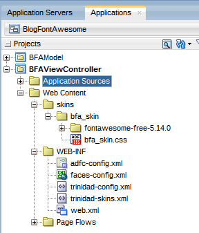
We start a new ADF Web Application (no model project is needed), using the normal wizard. Once the application is ready, select the ‘Web Content’ folder and create a new ‘Skin’ via the gallery. Name the skin as you like. This will create a skin.css file in a folder named ‘skin’.
The second step is to download the latest FontAwesome library (Version 5.14 when writing this blog). Extract the zip and copy the ‘fontawesome-free-5.14.0’ into the ‘create skin’ folder. This is the result of my sample application (you’ll find download instructions at the end of the article):
The next step is to make the FontAwesome fonts available to the ADF skin file. Here we add
@font-face {
    font-family: 'FontAwesome';
    src: url('fontawesome-free-5.14.0/webfonts/fa-brands-400.eot');
    src: url('fontawesome-free-5.14.0/webfonts/fa-brands-400.svg');
    src: url('fontawesome-free-5.14.0/webfonts/fa-brands-400.ttf');
    src: url('fontawesome-free-5.14.0/webfonts/fa-brands-400.woff');
    src: url('fontawesome-free-5.14.0/webfonts/fa-brands-400.woff2');
    src: url('fontawesome-free-5.14.0/webfonts/fa-regular-400.eot');
    src: url('fontawesome-free-5.14.0/webfonts/fa-regular-400.svg');
    src: url('fontawesome-free-5.14.0/webfonts/fa-regular-400.ttf');
    src: url('fontawesome-free-5.14.0/webfonts/fa-regular-400.woff');
    src: url('fontawesome-free-5.14.0/webfonts/fa-regular-400.woff2');
    src: url('fontawesome-free-5.14.0/webfonts/fa-solid-900.eot');
    src: url('fontawesome-free-5.14.0/webfonts/fa-solid-900.svg');
    src: url('fontawesome-free-5.14.0/webfonts/fa-solid-900.ttf');
    src: url('fontawesome-free-5.14.0/webfonts/fa-solid-900.woff');
    src: url('fontawesome-free-5.14.0/webfonts/fa-solid-900.woff2');
    font-weight: normal;
    font-style: normal;
}
to the bfa_skin.css. All this is described in Shay Shemltzer’s blog:
Integrating FontAwesome into ADF
In general, as Shay described, ADF uses skins to alter the look and feel. A skin is a special CSS using skin selectors to change the styles of a component. FontAwesome, on the other side, is a CSS library providing hundreds of icons that can be changed directly using CSS style classes.
In his blog, Shay shows how to work with FontAwesome icons by creating special skin classes or selectors that can be used with ADF components.
Let’s look at some of the commonly used ADF components:
af:outputText
The basic trick is to use the ‘:before’ or ‘:after’ CSS pseudo-class
.ambulance_before:before {
content: "\f0f9";
font-family: FontAwesome;
padding-right: 5px;
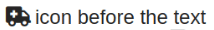
}and use this e.g. with an af:outputText
<af:outputText value="icon before the text" id="ot2" styleClass="ambulance_before" inlineStyle="font-size:x-large;"/>As a result we get:
Using the css below with the af:outputText
.ambulance_after:after {
    content: "\f0f9";
    font-family: FontAwesome;
    padding-left: 5px;
}
<af:outputText value="icon after the text" id="ot3" styleClass="ambulance_after" inlineStyle="font-size:x-large;"/>we get the following output:

You can change the size, color, and other things by adding the appropriate inline styles.
af:button
Adding some nice FontAwesome icons to an af:button component is easy, too. Here we have different possible locations to add the icon. The gear icon is a standard png icon and is not rendered by FontAwesome. I added it only to show that it is possible to add a normal icon.
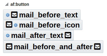
This output is generated by
The needed skins selectors are:
.mail_before_icon af|button::link:before {
    content: "\f199";
    font-family: FontAwesome;
    padding-right: 5px;
}

.mail_before_text af|button::text:before {
    content: "\f199";
    font-family: FontAwesome;
    padding-right: 5px;
}

.mail_after_text af|button::text:after {
    content: "\f199";
    font-family: FontAwesome;
    padding-left: 5px;
}
You see that we use the normal ‘af|button::text’ selector and add the ‘:before’ or ‘:after’ pseudo-class to it. Same for the icon.
af:icon
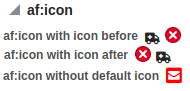
The af:icon component can be used together with FontAwesome. You can also use just one of the FontAwesome icons instead of one of the defaults.
To get this output, use
with these skin selectors:
.ambulance_before:before {
    content: "\f0f9";
    font-family: FontAwesome;
    padding-right: 5px;
}
.ambulance_after:after {
    content: "\f0f9";
    font-family: FontAwesome;
    padding-left: 5px;
}
.mail_before:before {
    content: "\f199";
    font-family: FontAwesome;
    padding-right: 5px;
}
If you don’t like to see the default icon, remove the name property from the af:icon as you see on the last af:icon.
af:link
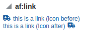
Same with af:link:

We see that we can use the same skin selectors on different components.
af:panelbox
It gets more interesting if we try to add a FontAwesome icon to an af:panelBox component. This component has two states: undisclosed and disclosed.
undisclosed:
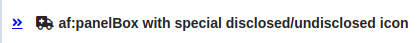
disclosed:
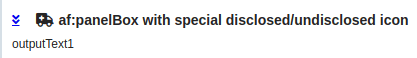
To get this output, we use:
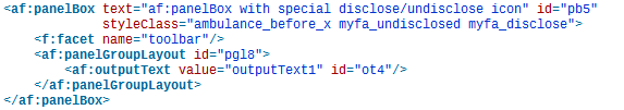
All the tweaking is done with three style classes: ‘ambulance_before_x’, ‘myfa_undisclosed’, and ‘myfa_disclose’:
.ambulance_before_x af|panelBox::header-element:before {
    content: "\f0f9";
    font-family: FontAwesome;
    padding-right: 5px;
}

.myfa_undisclosed af|panelBox::undisclosed-icon-style {
    width: 0;
    height: 0;
    display: inline-block;
}

.myfa_undisclosed af|panelBox::undisclosed-icon-style:after {
    content: "\f101";
    font-family: FontAwesome;
    padding-right: 5px;
}

.myfa_disclose af|panelBox::disclosed-icon-style {
    width: 0;
    height: 0;
    display: inline-block;
}

.myfa_disclose af|panelBox::disclosed-icon-style:after {
    content: "\f103";
    font-family: FontAwesome;
    padding-right: 5px;
}
The ambulance icon before the text is generated by using the skin selector ‘af|panelBox::header-element:before’. The special disclosed/undisclosed icon needs some more work.
Here we have to hide the original icons by setting their width and height to 0, then we select the FontAwesome icon using the pseudo-class ‘:after’
af:checkbox
The final sample for this article shows how to use a FontAwesome icon as a checkmark for an af:checkbox, and how to display a switch-like icon using pure CSS.
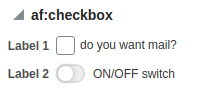
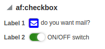
A more complex skin and more style classes are used here. I will show the skin for the ‘mail checkbox’ here only. You can see the switch done in pure CSS in the source of the sample:
/*------------------------------------------------------*/
/* BIGCHECKBOX */
/*hide checkbox*/
.bigcheckbox af|selectBooleanCheckbox::virtual-checkbox {
    opacity: 0;
    width: 0px;
    height: 0px;
}

.bigcheckbox input[type="checkbox"] {
    opacity: 0;
    width: 0px;
}
/*style label to display checkbox*/
.bigcheckbox .p_OraHiddenLabel {
    position: relative;
    left: inherit;
    font-size: 21px;
    top: 4px;
    content: "";
    display: inline-block;
    position: relative;
    width: 17px;
    height: 17px;
    left: inherit;
    margin-left: 0px;
    border: 1px solid rgb(133, 133, 133);
    border-radius: 3px;
    color: transparent;
}
/*style for unchecked state
Set the content to have no issues with moving elements when switching between states – the content is hidden, but save space for it.
*/
.bigcheckbox input[type="checkbox"]:not(:checked) + label:before {
    content: "ON";
    color: transparent;
    display: inline-block;
}
/*style for checked state*/
.bigcheckbox input[type="checkbox"]:checked + label:before {
    font-family: 'FontAwesome';
    content: "\f199";
    /*f14a code for Checkmark*/

    color: Blue;
    display: inline-block;
}
/*style for checked state*/
.bigcheckbox input[type="checkbox"]:disabled:checked + label:before {
    color: #8484ff;
}
/*styling disabled checkbox*/
.bigcheckbox input[type="checkbox"]:disabled + label {
    border-color: rgba(118, 118, 118, 0.3);
    opacity: 0.7;
}
/**/
.bigcheckbox af|selectBooleanCheckbox::item-text {
    margin: 0px 1px;
    padding-right: 3px;
    padding-left: 2px;
    vertical-align: middle;
    margin-left: 3px;
    position: relative;
    top: -1px;
}
/** set line height to fit the bigger rectangle */
.bigcheckbox af|selectBooleanCheckbox::content {
    line-height: 19px;
}
One problem is that the af:checkbox is rendered using different other components. If you like to take a look for yourself, use your browser development tools and check the HTML generated for the page.
Using different components is OK, but you need access to the underlying HTML input component. Only this component allows you to differentiate between the checked state and the unchecked state. We use selectors like
input[type=”checkbox”]:not(:checked)
input[type=”checkbox”]:checked
input[type=”checkbox”]:disabled:checked,…
to show different icons.
As an example, the selector
.bigcheckbox input[type=”checkbox”]:checked + label:before
is used to show the mail icon if the checkbox is checked.
One bigger problem is the position of the icon. It depends on the browser and other parameters. It took some time to make it work. In the skin, you’ll notice some ‘top: -5px;’ attributes. These are needed to align the checkbox with the text and the icon. The attributes that need to be set might differ on your browser.
Summary
We see that integrating FontAwesome and ADF works. It’s not as simple as it could be, but using different things together sometimes needs some tweaking.
What I did not get to work, is to use the icon properties of the ADF components (icon depressedIcon,…) which are used e.g. by af:panelDrawer or af:showDetailItem. Here, the problem is that you can add the style to the af:panelDrawer or af:showDetailItem only. This will give you one icon on all drawers, not a different one for each drawer.
I’m sure you can tweak this for the generated classes. However, this defeats the usage of a skin as you then add something that you can only use for one specific panelDrawer. Here I would use icons and not FontAwesome.
Sample
You can download the sample application from GitHub or as a zip. The sample was built using JDeveloper 12.2.1.4 and doesn’t need any DB connection.

- ADF: Dump Query and ALL VO Query Parameters - 21. Juni 2021
- Pass User and ApplicationModule Information to Database Session - 30. März 2021
- JDeveloper 12c: af:tree show/hide expand icon depending on the number of children - 25. Februar 2021


