In my blog JDeveloper 12.2.1.4: ADF FontAwesome Integration I talked about the integration of FontAwesome into an ADF skin. In this short update, I added the skin selectors for the af:selectOneRadio component.
Add Styles to af:selectOneRadio
I added two uses cases to the existing sample application (download link at the end of this blog):
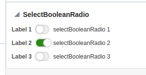
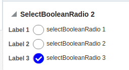
This was an easy task as the selectors of the af:selectBooleanCheckbox from the first post could be used as a starting point. The difference between the two is that one uses the self-drawn switch (left) and one uses a FontAwesome icon (right) to show the selected state.
I just renamed the selectors to af:selectOneRadio and 90% of the work was done. The remaining 10% is moving the image a bit up and to the left.
The final skin selectors are:
/**-----------------------------------------------------------------------------*/
/* BIGSWITCHRADIO */
/**hide checkbox*/
.bigswitchradio af|selectBooleanRadio::virtual-radio {
    opacity: 0;
    width: 0px;
    height: 0px;
}
/**/
.bigswitchradio af|selectBooleanRadio::item-text {
    margin: 0px 1px;
    padding-right: 3px;
    padding-left: 2px;
    vertical-align: middle;
    margin-left: 1px;
    position: relative;
    top: -1px;
}
/** set line hight to fit the bigger rectangle */
.bigswitchradio af|selectBooleanRadio::content {
    line-height: 19px;
}
/*style label to display checkbox*/
.bigswitchradio .p_OraHiddenLabel {
    position: relative;
    left: inherit;
    font-size: 0px;
    top: 4px;
    content: "";
    display: inline-block;
    position: relative;
    left: inherit;
    margin-left: 0px;
    border-radius: 3px;
    color: transparent;
}
/*style label to display checkbox*/
.bigswitchradiox .p_OraHiddenLabel {
    position: relative;
    left: inherit;
    font-size: 12px;
    top: inherit;
    content: "";
    display: inline-block;
    position: relative;
    left: inherit;
    margin-left: 0px;
    width: 0px;
    border-color: Black;
}

.bigswitchradio input[type="radio"] {
    display: none;
}

.bigswitchradio input[type="radio"] + label {
    position: relative;
    display: inline-flex;
    cursor: pointer;
    font-family: sans-serif;
    font-size: 0px;
    color: transparent;
}

.bigswitchradio input[type="radio"] + label:before {
    width: 25px;
    height: 15px;
    border-radius: 15px;
    border: 2px solid #ddd;
    background-color: #EEE;
    content: "";
    margin-right: 5px;
    transition: background-color 0.5s linear;
}

.bigswitchradio input[type="radio"] + label:after {
    width: 15px;
    height: 15px;
    border-radius: 15px;
    background-color: #fff;
    content: "";
    transition: margin 0.1s linear;
    box-shadow: 0px 0px 5px #aaa;
    position: absolute;
    left: 2px;
    top: 2px;
}
/*styling disabled chheckbox*/
.bigswitchradio input[type="radio"]:disabled + label {
    border-color: Black;
    color: #add8e6;
    opacity: 0.5;
}

.bigswitchradio input[type="radio"]:checked + label:before {
    background-color: #2b8718;
}

.bigswitchradio input[type="radio"]:checked + label:after {
    margin: 0 0 0 15px;
}
/*------------------------------------------------------*/
/* BIGRADIO */
/**hide checkbox*/
.bigRadio af|selectBooleanRadio::virtual-radio {
    opacity: 0;
    width: 0px;
    height: 0px;
}

.bigRadio input[type="radio"] {
    opacity: 0;
    width: 0px;
}
/*style label to display checkbox*/
.bigRadio .p_OraHiddenLabel {
    position: relative;
    left: inherit;
    font-size: 21px;
    top: 4px;
    content: "";
    display: inline-block;
    position: relative;
    width: 20px;
    height: 18px;
    left: inherit;
    margin-left: 0px;
    border: 1px solid rgb(133, 133, 133);
    border-radius: 12px;
    color: transparent;
}
/*style for unchecked state
Set the content to have no issues with moving elements when switching between states – the content is hidden, but save space for it.
*/
.bigRadio input[type="radio"]:not(:checked) + label:before {
    content: "ON";
    color: transparent;
    display: inline-block;
}
/*style for checked state*/
.bigRadio input[type="radio"]:checked + label:before {
    font-family: 'FontAwesome';
    content: "\f058";
    /*f14a code for Checkmark*/
    color: Blue;
    display: inline-block;
}
/*style for checked state*/
.bigRadio input[type="radio"]:disabled:checked + label:before {
    color: #8484ff;
}
/*styling disabled chheckbox*/
.bigRadio input[type="checkbox"]:disabled + label {
    border-color: rgba(118, 118, 118, 0.3);
    opacity: 0.7;
}
/**/
.bigRadio af|selectBooleanRadio::item-text {
    margin: 0px 1px;
    padding-right: 3px;
    padding-left: 2px;
    vertical-align: middle;
    margin-left: 3px;
    position: relative;
    top: -1px;
}
/** set line hight to fit the bigger rectangle */
.bigRadio af|selectBooleanRadio::content {
    line-height: 19px;
}
Sample
You can download the sample application from GitHub or as a zip. The sample was built using JDeveloper 12.2.1.4 and doesn’t need any DB connection.

- ADF: Dump Query and ALL VO Query Parameters - 21. Juni 2021
- Pass User and ApplicationModule Information to Database Session - 30. März 2021
- JDeveloper 12c: af:tree show/hide expand icon depending on the number of children - 25. Februar 2021


